Gerrymandering is a practice intended to
establish a political advantage for a particular party
of group by manipulating district boundaries.
Historically, different metrics of gerrymandering have
been presented to courts to support rationales to claim
illegal gerrymandering. There is not yet a universally
agreed-upon metric for evaluating splitting of municipal
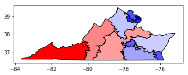
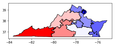
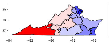
units with districting plans. Commonly used metrics
usually focus on either
geographical compactness (number of cuts and
splits) or
partisan symmetry and vote efficiency
(efficiency gap, mean-median, number of seats won by a
certain Party).
The wide variety in rules applied to districting
problems (even in the same state) means that any single
measure of gerrymandering will be
insufficient/exploitable. Therefore, one approach is to
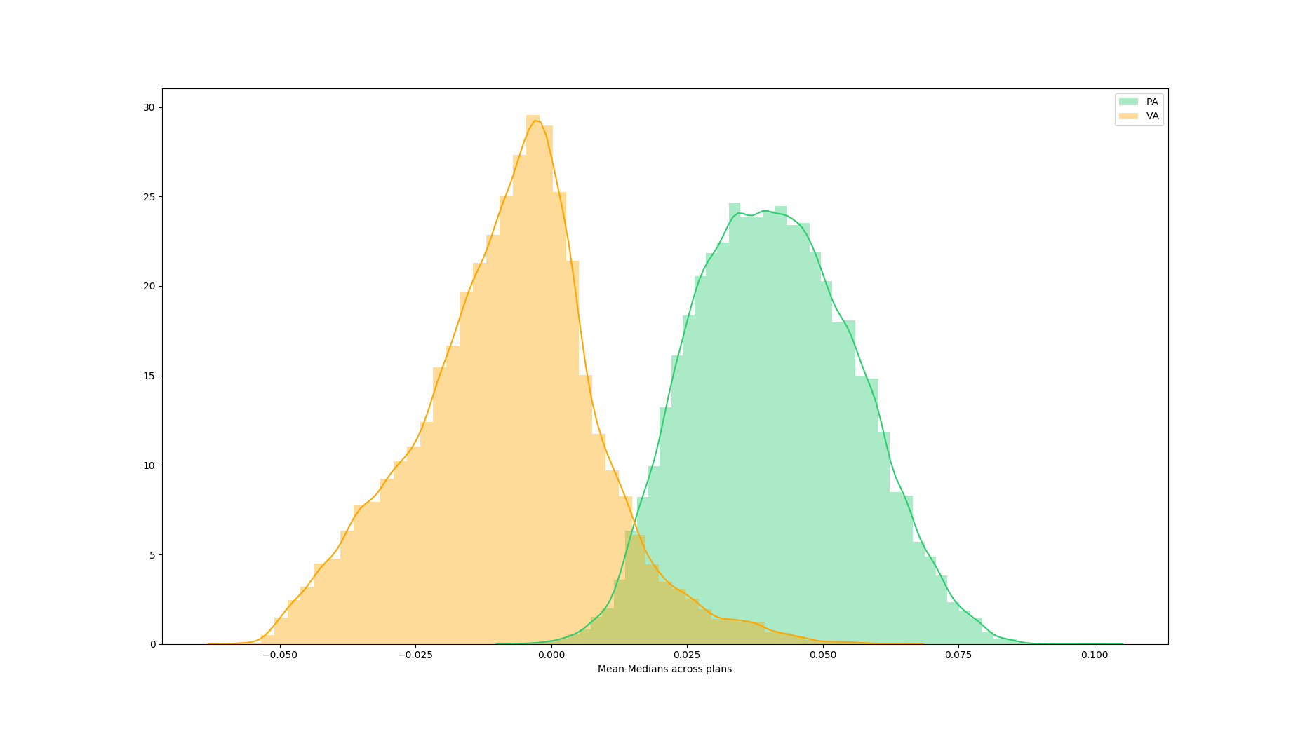
generate large ensembles of districting plans to explore
the underlying political geography of a given states.
Rather than focusing on any particular plan, the
“ensemble approach” uses simulated data to study the
universe of possible plans and conduct outlier analysis
by comparing to large ensembles of other feasible plans.
However, computational redistricting is not a
solved problem!
Even though scholars have developed different
statistical methods that courts can use to spot
manipulative districting, there is no one coherent and
consistent standard. Additionally, there is a great deal
of interplay between the legal constraints and the
metrics of interest and among the metrics themselves.
Researchers have struggled to effectively represent the
distributions of values within the high dimensional data
and inspect the distributions under multiple metrics in
an unbiased manner.
We partner with researchers at MIT CSAIL working in the
Metric Geometry and Gerrymandering Group (MGGG)
to design an interactive data visualization system to:
-
Unveil some hidden interactions between
different metrics and show their impact on each
other in an unbiased way;
-
Demystify some common false beliefs;
-
Propose a novel way of looking at
gerrymandering for policy makers and the general
public in an easily digestible manner.